…apply a visual system?
Set data-gs-style on a page region, or use theme on a desktop environment.
<main data-gs-style="retro">
<article class="gs-card">…</article>
</main>
<gessi-desktop theme="classic-os">
…
</gessi-desktop>A dependency-free CSS and Web Component kit for expressive HTML. Start with a page, then add a desktop, window, media effect, or another component only when it helps.
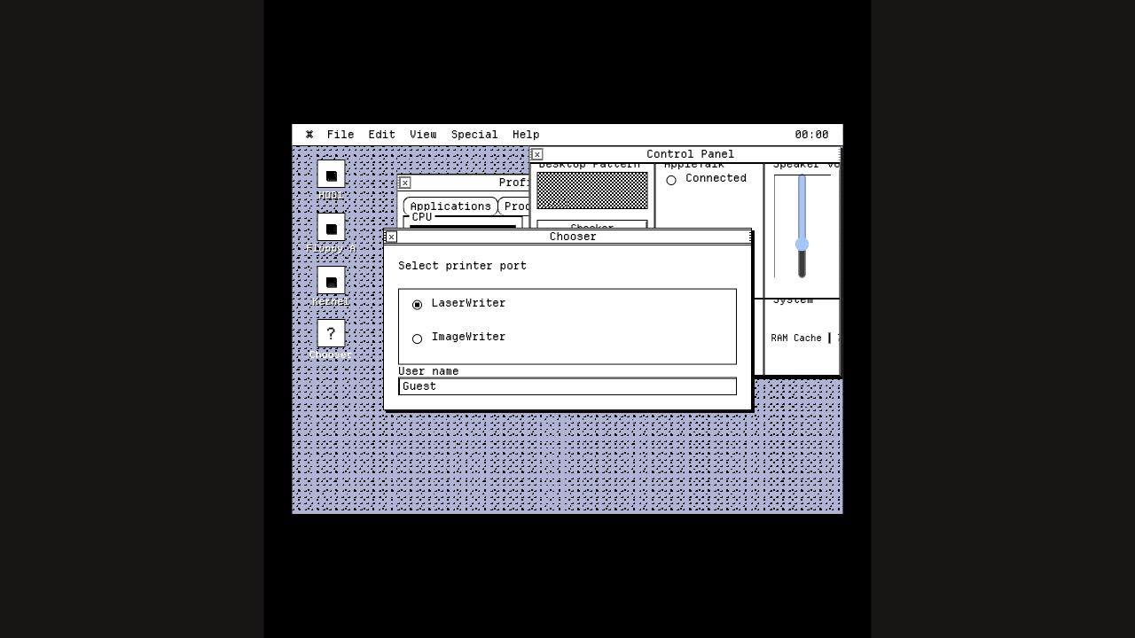
Windows, menus, media, maps, themes, and interactions are included.
Paste this into an HTML file. It loads Gessi’s CSS and registers the components. Then use normal HTML inside them.
<script
  type="module"
  src="https://cdn.jsdelivr.net/npm/@pol-cova/gessi/dist/gessi.js"
></script>

<gessi-desktop menu="◆ My OS,File,View,Help" clock="09:41">
  <gessi-window title="hello.html" width="38rem" active draggable>
    <h1>One script, plain HTML</h1>
    <p>No package manager, bundler, or framework required.</p>
  </gessi-window>
</gessi-desktop>Use this when your project already has a build step. The CSS and component import stay separate so SSR remains safe.
npm install @pol-cova/gessiimport "@pol-cova/gessi/css";
import "@pol-cova/gessi/components";@pol-cova/gessiPackage default; stylesheet@pol-cova/gessi/cssStyles only; no registration@pol-cova/gessi/componentsSSR-safe component registration@pol-cova/gessi/gessi.jsCDN entry; loads sibling CSSStart with the outcome you need. Each recipe is deliberately small enough to paste into a real project.
Set data-gs-style on a page region, or use theme on a desktop environment.
<main data-gs-style="retro">
  <article class="gs-card">…</article>
</main>

<gessi-desktop theme="classic-os">
  …
</gessi-desktop>Keep the dialog in ordinary HTML, then call its small public API from a native button.
See window and dialog attributes →<button id="open">Settings</button>
<gessi-dialog id="settings" title="Settings" hidden>
<button>Done</button>
</gessi-dialog>
<script>
const open = document.querySelector("#open");
const dialog = document.querySelector("#settings");
open.onclick = () => dialog.open();
dialog.querySelector("button").onclick = () => dialog.close();
</script>Pass space-separated effects. Gessi composes them in the browser and leaves the source file unchanged.
Browse media effects →<gessi-media
src="/photo.jpg"
alt="Night market"
effect="chromatic grain scanlines"
frame="polaroid"
></gessi-media>Wrap generated HTML in gessi-document or add class="gs-prose". No JavaScript or framework adapter is required.
<gessi-window title="notes.md" active>
  <gessi-document>
    <h1>Release notes</h1>
    <p>Rendered Markdown stays semantic.</p>
  </gessi-document>
</gessi-window>Import CSS during the build and register components from a browser module. The component import is guarded for SSR.
Open framework recipes →import "@pol-cova/gessi/css";
import "@pol-cova/gessi/components";Use Gessi when the interface benefits from recognizable places, tools, documents, media, or system chrome—not only for literal operating-system recreations.
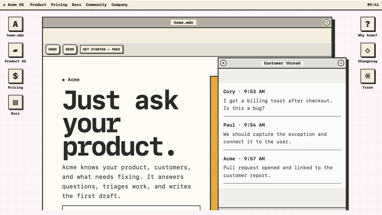
Put product copy in a primary window, supporting proof in smaller windows, and navigation in the menu bar or dock.
Use:gessi-desktop
gessi-window
gessi-toolbar
Open Product OS →
Represent projects as files, folders, documents, windows, or media objects while keeping every link and heading semantic.
Use:gessi-icons
gessi-tree
gessi-media
Open the plain HTML start →
Compose status panels, meters, lists, alerts, tabs, and dialogs without adopting a JavaScript framework runtime.
Use:gessi-panel
gessi-meter
gessi-dialog
Open Classic OS →
Drop generated Markdown into document styling, then frame it as a file, window, card, or plain article.
Use:gessi-document
.gs-prose
.gs-callout
Open Markdown post →
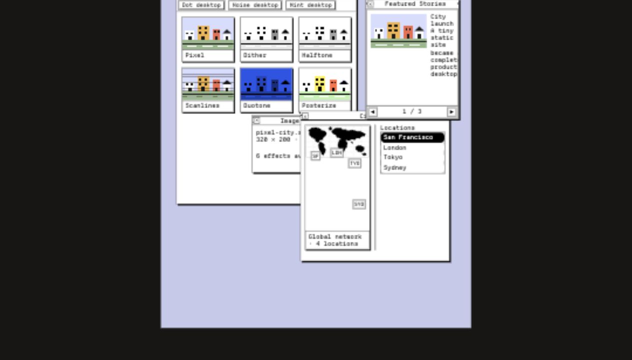
Layer composable effects over source images, add accessible map markers, and present collections as a carousel.
Use:gessi-media
gessi-map
gessi-carousel
Open Media OS →
Use one dominant window for the primary narrative. Smaller windows should add context, not repeat the same content.
<gessi-desktop theme="neo">
  <gessi-window title="product.html" active zoomable>
    <main class="product-layout">
      <h1>Ship the work that matters.</h1>
      <p>Your product-specific content stays ordinary HTML.</p>
      <a class="gs-btn" href="/signup">Start free</a>
    </main>
  </gessi-window>
</gessi-desktop>Let Gessi provide reusable chrome while labels, fields, and actions remain native controls.
<section data-gs-style="classic-os">
  <gessi-panel title="Preferences" columns="2">
    <label>Display name <input value="Ada"></label>
    <label>Theme
      <select><option>Classic OS</option></select>
    </label>
    <gessi-meter label="Storage" value="64"></gessi-meter>
    <button type="submit">Save changes</button>
  </gessi-panel>
</section>The effect belongs to presentation. Keep useful alt text and the original image asset.
<div class="project-grid" data-gs-style="retro">
  <gessi-media
    src="/work/archive.jpg"
    alt="Printed archive interface"
    effect="dither grain"
    caption="Archive, 2026"
    zoomable
  ></gessi-media>
</div>Gessi is AI-friendly because the output is still semantic HTML: a small set of named components, ordinary content elements, and explicit attributes instead of generated wrapper trees.
Replace the bracketed project details, paste it into your coding agent, and include a screenshot or product brief when you have one.
You are implementing [PROJECT OR PAGE] using Gessi, a dependency-free CSS
and native Web Component library for expressive HTML.

Goal:
- Build [DESCRIBE THE INTERFACE AND PRIMARY USER TASK].
- Use the [neo | minimal | retro | old-tech | classic-os] visual system.
- Match [REFERENCE, BRAND, OR ART DIRECTION].

Integration:
- For plain HTML, load:
  <script type="module"
    src="https://cdn.jsdelivr.net/npm/@pol-cova/gessi/dist/gessi.js">
  </script>
- For a bundler, import "@pol-cova/gessi/css" and
  "@pol-cova/gessi/components".
- Do not add a framework runtime only to use Gessi.

Implementation rules:
- Use Gessi components for reusable interface chrome: desktop, windows,
  dialogs, menus, toolbars, docks, panels, alerts, media, maps, or carousels.
- Keep project content as semantic HTML: headings, links, buttons, lists,
  forms, images, and sections.
- Keep content in light DOM. Do not introduce Shadow DOM.
- Use native buttons for actions and native links for navigation.
- Put project-specific grids and content layout in ordinary scoped CSS.
- Do not invent one-purpose utility classes or wrap every element in a
  custom component.
- Keep imports safe during SSR and do not access browser globals at module
  evaluation time.
- Preserve keyboard access, visible focus, useful accessible names, alt text,
  long-content handling, and prefers-reduced-motion.
- At widths below 720px, convert positioned desktop UI into readable document
  flow without separate mobile markup.

Deliver:
1. The working implementation.
2. Any small scoped CSS needed for [PROJECT].
3. A short explanation of the chosen Gessi components.
4. Browser verification at desktop and mobile widths.

Before finishing, verify that the page has no horizontal overflow, clipped
content, console errors, inaccessible generic click targets, or unreadable
theme contrast.Switch the style attribute. Components and semantic content remain unchanged.
Cards, controls, forms, and OS components share the selected visual language.
Use data-gs-style="custom" or theme="custom", then set stable --gs-* tokens on the same element. These tokens are the supported customization surface for color, type, border, radius, shadows, focus, and window chrome.
--gs-inkPrimary text and foreground color--gs-paperBase surface color--gs-lineBorder and keyline color--gs-blue --gs-mint --gs-tomato --gs-sunAccent palette--gs-radius --gs-border-widthRadius and border scale--gs-shadow --gs-shadow-smSurface and control elevation--gs-window-bg --gs-window-title-bg --gs-window-body-bgDesktop window chrome--gs-toolbar-bg --gs-control-bg --gs-control-textMenus, toolbars, and action controls--gs-focusVisible focus outline<gessi-desktop
theme="custom"
style="--gs-ink: #1b1026; --gs-paper: #fff7d6; --gs-line: #1b1026;
--gs-window-title-bg: #ffd447; --gs-control-bg: #2ee6a6;"
>
<gessi-window title="tokens.html" active>...</gessi-window>
</gessi-desktop>Use the class layer for normal pages, or combine it with the OS components.
.gs-cardContent surface.gs-btnButtons and links.gs-fieldInputs and selects.gs-gridResponsive content grid.gs-stackVertical rhythm.gs-clusterInline control group.gs-chipCompact metadata.gs-proseRendered Markdown and long-form content.gs-progressProgress indicatorUse gessi-document or .gs-prose around rendered Markdown. Headings, tables, code blocks, blockquotes, footnotes, task lists, callouts, and metadata are styled without JavaScript.
Markdown output remains ordinary HTML, so links, lists, tables, and headings keep their native behavior.
Use .gs-callout for notes generated by Markdown plugins or hand-authored MDX.
<article class="gs-prose">
  <h1>Post title</h1>
  <p class="gs-file-meta"><time datetime="2026-07-08">Jul 8, 2026</time></p>
  <p>Generated Markdown HTML goes here.</p>
</article>
export function BlogPost({ children, meta }) {
return (
<gessi-window title={`${meta.slug}.mdx`} active>
<gessi-document>
<p className="gs-file-meta">
<time dateTime={meta.date}>{meta.date}</time>
<span>{meta.readingTime}</span>
</p>
{children}
</gessi-document>
</gessi-window>
);
}---
import "@pol-cova/gessi/css";
const { Content, entry } = Astro.props;
---
<script>import "@pol-cova/gessi/components";</script>
<gessi-window title={`${entry.slug}.md`} active>
<gessi-document>
<p class="gs-file-meta">
<time datetime={entry.data.date.toISOString()}>{entry.data.date.toDateString()}</time>
</p>
<Content />
</gessi-document>
</gessi-window><article class="gs-prose">
<p class="gs-file-meta">
<time datetime="{{ page.date | htmlDateString }}">{{ page.date | readableDate }}</time>
<span>{{ page.fileSlug }}.md</span>
</p>
{{ content | safe }}
</article><gessi-document>
<p class="gs-file-meta">
<time datetime="{{ .Date.Format "2006-01-02" }}">{{ .Date.Format "Jan 2, 2006" }}</time>
<span>{{ .File.Path }}</span>
</p>
{{ .Content }}
</gessi-document>Background patterns, semantic menus, icons, window stacking, and keyboard management are built in.
<gessi-desktop
  theme="classic-os"
  storage-key="product-desktop-v1"
  background="#c5c9ea"
  pattern="grid"
  pattern-color="#5a5f92"
>
  <nav slot="menu">
    <strong>⌘ Product OS</strong>
    <a href="/">File</a>
    <button type="button">Help</button>
  </nav>

  <gessi-window title="Projects" active draggable>
    Your normal HTML
  </gessi-window>
</gessi-desktop>storage-key opts into localStorage persistence for position, size, layer, minimized, hidden, and active state. No storage access happens unless the attribute is present in the browser.
serializeLayout() returns JSON-safe state, restoreLayout(layout) applies trusted state, and resetLayout() clears the stored key.
gs-layout-restore-before is cancelable. gs-layout-restore-after fires with the restored layout.
Fifteen original 32px SVGs ship in @pol-cova/gessi/icons. Use gessi-icon for a decorative desktop glyph, or give a normal <img> useful alternative text when the icon conveys information.


<!-- Decorative: the text label is the accessible name. -->
<gessi-icon src="./node_modules/@pol-cova/gessi/dist/icons/folder.svg" label="Projects"></gessi-icon>

<!-- Meaningful: use a native image and describe its purpose. -->
<img src="./node_modules/@pol-cova/gessi/dist/icons/warning.svg" alt="Warning: unsaved changes">const desktop = document.querySelector("gessi-desktop");
const key = "my-desktop-layout";
desktop.restoreLayout(localStorage.getItem(key));
desktop.addEventListener("gs-layout-change", () => {
localStorage.setItem(key, JSON.stringify(desktop.serializeLayout()));
});Generated chrome, draggable positioning, nested child windows, focus stacking, controls, slots, and dialog focus management.
<gessi-window>title x y width height draggable minimizable zoomable
toolbar sidebar status
<gessi-dialog>open() and close(), Escape handling, focus trapping, and focus restoration.
Build control panels, status surfaces, notifications, and file-like interfaces out of the box.
<gessi-timeline>A semantic chronological list for posts, release notes, activity, and mail. Place each record in a gessi-entry.
<gessi-form>A responsive layout wrapper for a real form. Use columns or compact; native controls and server attributes stay intact.
<gessi-load-more>Centres a normal link or button for server pagination and optional HTMX fragment loading.
A journal entry can be rendered as a page or a server fragment.
<gessi-timeline id="journal-feed" aria-label="Journal">
  <gessi-entry status="published">
    <article>
      <p class="gs-file-meta"><time datetime="2026-07-10">Jul 10</time></p>
      <h2><a href="/journal/a-small-web">A small web</a></h2>
      <p>This is ordinary server-rendered HTML.</p>
    </article>
  </gessi-entry>
</gessi-timeline>

<gessi-load-more>
  <a href="/journal?page=2" hx-get="/journal?page=2"
     hx-target="#journal-feed" hx-swap="beforeend">Load older entries</a>
</gessi-load-more>

<form action="/newsletter/subscribe" method="post">
  <gessi-form columns="2">
    <label class="gs-label">Email
      <input name="email" type="email" autocomplete="email" required>
    </label>
    <div class="gs-form-actions">
      <button type="submit">Subscribe</button>
    </div>
  </gessi-form>
</form>Stack effect names without changing the original file or shipping an image-processing dependency.
<gessi-media
  src="/photo.jpg"
  alt="Night market"
  effect="chromatic grain scanlines"
  frame="polaroid"
  aspect="4 / 3"
  zoomable
></gessi-media>Use a real image or inline SVG, then place accessible percentage-based markers above it.
Every direct child becomes a keyboard-accessible slide with generated themed controls.
<gessi-carousel aria-label="Featured work" autoplay="5000">
  <article>First story</article>
  <article>Second story</article>
  <article>Third story</article>
</gessi-carousel>Below 720px, desktop composition becomes readable document flow without separate mobile markup.
Native custom elements work in Astro, Eleventy, Hugo, Jekyll, server templates, and framework applications.
<script type="module"
  src="https://cdn.jsdelivr.net/npm/@pol-cova/gessi/dist/gessi.js">
</script>
---
import "@pol-cova/gessi/css";
---
<script>
import "@pol-cova/gessi/components";
</script>node_modules/@pol-cova/gessi/dist/gessi.css
node_modules/@pol-cova/gessi/dist/gessi.jsDesktop interactions include keyboard window management and accessible dialog behavior.
Open the examples, inspect the source, and use them as starting points.